In today’s fast-paced world, it is no surprise that everyone is running multiple errands at once. Businesses are expanding by the minute, and it eventually becomes difficult to keep track of the ‘chaos’ around you. Scheduling apps came into existence to ease this chaos.
In this article, I take a look at the various features of two popular scheduling apps: Doodle and Calendly. Also, this article will help you figure out which one is better suited for your business.
Doodle vs Calendly Comparison Table
|
| Doodle | Calendly |
| Features | 4/5 | 4/5 |
| Interface | 4/5 | 4.5/5 |
| Integrations | 3/5 | 4/5 |
| Native payment integration | None | PayPal + Stripe |
| Entry-level Pricing | Free | Free |
Introducing Doodle

Doodle is easily one of the most popular scheduling apps on the market. It has a monthly user base of about 30 million. This client base is a testament to the quality of the app. One thing to note, however, is the correct use-case of the software. Doodle is not for freelancers trying to manage their clients. Instead, it aims to ease the process of holding internal meetings within teams. This differentiation is significant, and you should consider it during further comparisons. As such, you cannot achieve an accurate apples-to-apples comparison in all categories, between Doodle and its competitor, Calendly.
Introducing Calendly

Calendly is a meeting scheduler and services booking software. To be more specific, it is a tool that streamlines the process of scheduling a meeting or booking a service. You can send your Calendly shareable link via email, SMS, etc. You can also embed the widget onto your website. The concerned parties can then book their preferred slot for the meeting. In essence, it is an elegant solution to replace back-and-forth emails and other conventional booking methods. How does it stack up to our competitor? We shall find out!
Criteria For Comparison
- User interface
- Integrations
- Payment integrations
- Pricing
User Interface
The importance of this is paramount on two fronts: back-end and client-facing end. Your clients should feel at-home when trying to book an appointment. Likewise, the interface should not overwhelm the back-end users. For these reasons, the user interface is one of the most important aspects of any software. Here, I have compared the experiences offered by both software packages.
Doodle – User Interface
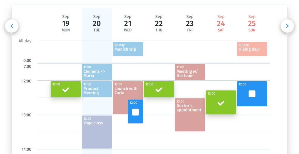
Doodle provides a very feature-rich user experience. The dashboard gives you a lot of information in hand. It lays out your meetings in chronological order, along with some information about each of them. The entire user experience revolves around a collaborative environment. You can now let each member of your team pick their preferred dates and flex your schedule accordingly.
Additionally, Doodle’s back-end interface is a little special. For each occasion or event, you can create a custom poll. You can also tweak the settings for the participants and send out email links to your team. The team can then vote for their preferred date. This feature facilitates the process of finding the ideal date and time to hold a meeting. Lastly, iOS and Android support for smartphones put the cherry on top of a rather compelling ‘cake.’
Calendly – User Interface
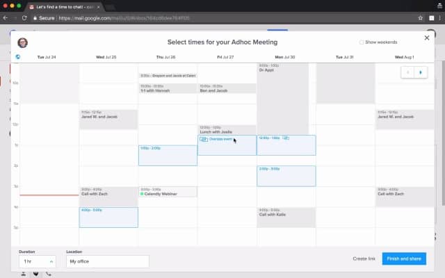
I can summarize Calendly’s experience in one word: clean. There is a deliberate attempt to not overwhelm you, as a user. As a result, there are not many icons and buttons cluttering the dashboard. The overall white background further adds a professional touch to the overall experience. However, you have to make a tradeoff to achieve this. The dashboard does not have as much information as on Doodle. Aside from this, the client-facing experience continues this trend of simplicity. The booking options are neatly laid out. You have full control of your schedule on the back-end. You can tailor-make various event types based on your business needs. On the whole, the folks at Calendly have put together an attractive scheduling package that caters to most businesses.
My Pick!
Calendly is my personal favorite among the two. Its understated looks offer a feeling of professionalism that is missing in Doodle’s interface. The minimal, yet powerful nature of Calendly’s user interface is ideal for most businesses. However, fixing the best possible time for a group meeting is a breeze using Doodle. The poll options are easy to view and access. Doodle is an attractive option for medium-sized and large businesses that are looking to simplify the scheduling process of meetings.
Integrations
The power of any scheduling software extends beyond its realms. For a bonafide all-in-one solution, any scheduling software must offer deep integration with other business apps. With this in mind, I have taken a look at the integration options present in both our competitors.
Doodle – Integrations
Doodle offers a decent number of integration options. It supports most business calendars natively. Besides, it integrates with Slack, Zapier, and even has an API for customizability. Right off the bat, you can see that the options are pale in comparison to other options in the market. This lack of choice is a limitation when it comes to the automation flexibility for businesses. However, Doodle sets out to make scheduling meetings easier. As such, the integration options are entirely in line with the goal in mind. Complete with ‘MeetMe’ integration, this app truly streamlines the process of scheduling meetings.
Calendly – Integrations
I tip my hat to the ‘integrations’ page on Calendly’s website. A segmented overview of supported integrations greets potential customers. It then comes as no surprise as to why Calendly is renowned for its integrations. They offer integrations with all major calendars and CRM packages.
Furthermore, you can connect to Zapier and further expand your integration options. Google Analytics and Facebook Pixel add a new dimension to your business. They achieve this by providing you with a near-perfect picture of your conversion metrics and other relevant data.
Clear-Cut Winner!
In terms of the sheer number of integrations, Calendly easily takes the cake. It offers a full suite of options ranging across many categories. It is as close to a ‘complete’ solution as you can get, while Doodle lacks this variety. So on this front, it is quite easy to pick Calendly as the definitive winner.
Payment Integrations
Getting paid for your service is undoubtedly one of the best feelings. Hence, the process of getting paid in itself should not hamper those feelings. Scheduling software solutions take care of this by offering payment integration solutions. In simple terms, they help save time and resources by streamlining the payment process. In this section, I take a look at each software’s payment integration solutions.
Doodle – Payment Integrations
Doodle is more of a productivity booster than anything else. For this reason, it does not include any payment integration natively. You can, however, integrate apps through Zapier. There is not much else to say in this regard. The ideal use-case scenario for Doodle revolves around scheduling team meetings within a company. As such, it does not need integration with payment solutions.
Calendly – Payment Integrations
Calendly offers something for everyone. If you want to build a payment platform from scratch, integration with Stripe will surely benefit you. Undoubtedly, it is not easy to set up. However, you are presented with a host of features once you do. If you are looking for a simple way to get started, PayPal is the way to go. Here too, Calendly has got you covered. As a result, you have the flexibility to sell your product/service without any time or location constraints. Lastly, you can integrate POS services like Square to your business using Zapier.
Better Than The Rest!
Here too, it is relatively easy to pick a winner. Calendly offers payment integration, while Doodle does not. When viewed in a vacuum, Calendly is the clear winner. Even if your business needs do not require payment integration, it does not hurt to have the option to do so.
Pricing
Pricing is one factor that needs little to no explanation. You want your business to incur as little cost as possible. Investing in software that saves you time should, ideally, not break the bank. Consequently, it is very important to consider the pricing schemes of both software packages. Here, I do just that and compare the value offered by each software at the price point.
Doodle – Pricing
Doodle offers a ‘freemium’ pricing scheme. Although ads are present all over the page, you can surely get a feel for the improved productivity that Doodle promises to bring. Obviously, you will have to subscribe to their services for a better experience. You can get started with their aptly named ‘Starter’ package for $4/mo/user. Upgrading to their ‘Pro’ package unlocks even more features at $6/mo/user. Bigger businesses can opt for their ‘Team’ package that runs in at $30/mo/5 users. Enterprise solutions are available upon request, with pricing available upon request.
Calendly – Pricing
It costs absolutely nothing to get on-board Calendly. Their ‘freemium’ pricing model gives you a small taste of what they have in store without breaking the bank. Moreover, if you are satisfied with the experience, you can opt for the ‘Premium’ or ‘Pro’ package based on what your business needs. For $8/mo/user, you can purchase their ‘Premium’ package and enjoy a more feature-rich experience. Calendly ‘Pro’ will cost you $12/mo/user in exchange for their full roster of features. On the whole, the folks at Calendly have attractively priced their services for businesses of all sizes.
A Close Call
My favorite part of both apps is the freemium pricing model. You can even try both before deciding which one suits your business. Doodle has a lower price point when compared to Calendly. In my opinion, there is also slightly more flexibility in terms of payment options. If the feature-set appeals to you, Doodle is the way to go. However, the feature-set of Calendly demands a few extra bucks.
Doodle vs. Calendly: Which One Should You Choose?
Both apps cater to completely different use cases. While Calendly positions itself to be an all-in-one solution for freelancers and small business owners, Doodle aims at the larger corporations. Big teams can now easily schedule their meetings. Furthermore, it provides a relatively hassle-free interface on mobile and PC platforms. In conclusion, the answer to this question is, unsurprisingly, it depends. It depends on what you do and what your business does. Use this guide to narrow down your business needs and pick the best-fit solution!
Checkout out our best appointment scheduling software post to see all of the top applications available today.


